Websites that sell have many, many things in common, and none of them are a coincidence.
Every successful catering website incorporates more than just well written copy and an aesthetically pleasing design. The best appease the visitor and search engines, and they do so in a strategic fashion specific to this industry and its particular target market(s).
These seven website hacks will point you in the direction of a website that really sells, plus—you’ll learn how to test and apply each one right here.

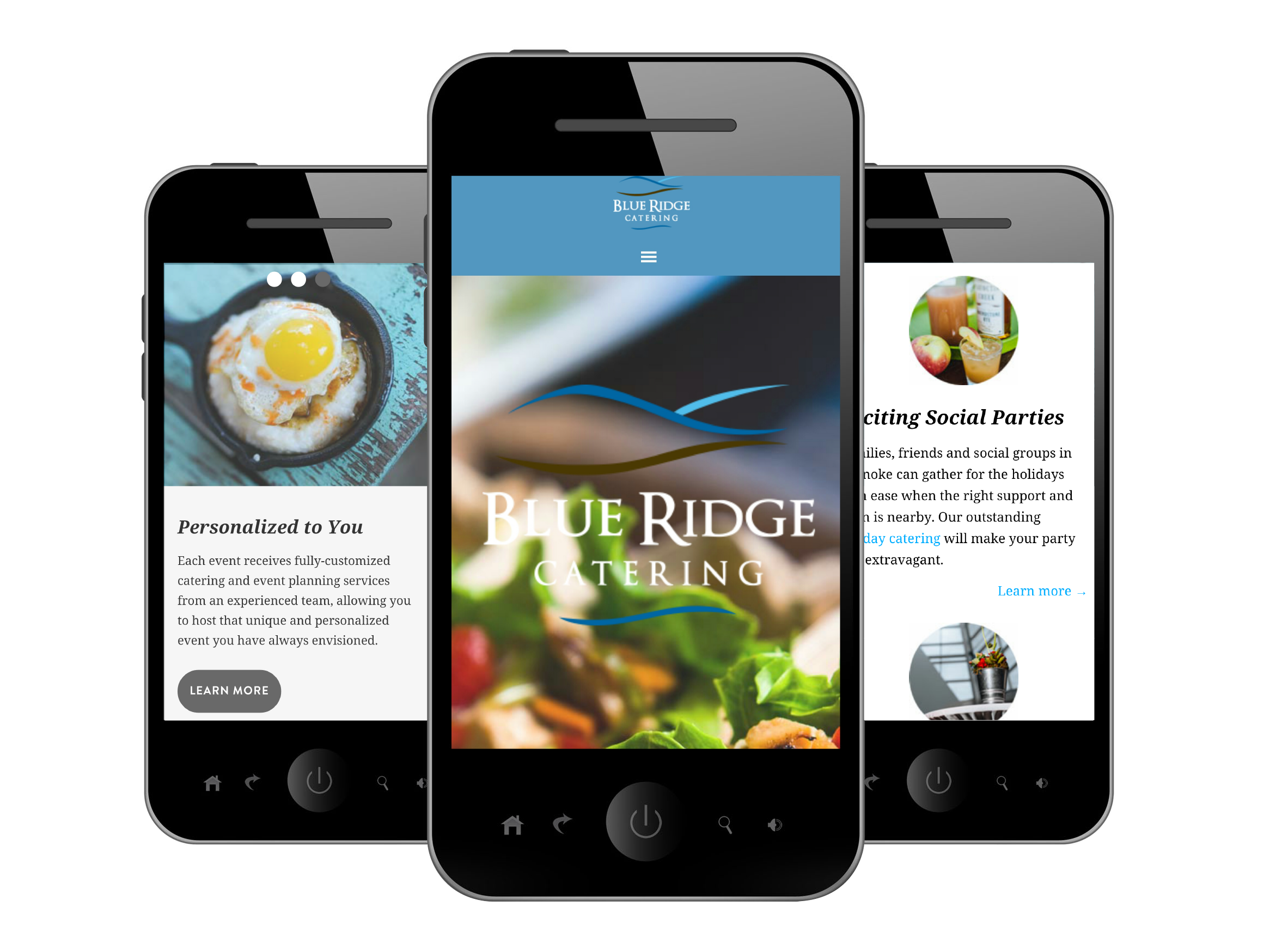
Get a really great mobile-optimized website.
The more society becomes dependent on mobile devices, the more you will need to focus on your mobile website. Currently, 60 percent of all online traffic happens on a mobile or tablet device. For caterers specifically, 55 percent of all search traffic leading to a catering website happens on a mobile device.
Non-mobile-friendly websites will hurt your sales and so will non-optimized mobile websites.
Do these two things to make sure you’re not hindering sales with your mobile website:
1) Test your site to make sure it’s mobile-friendly. You can find Google’s free tool by typing “Google webmaster mobile friendly test tool” in your Google search bar.
2) If you pass the Google test and have a “mobile-friendly” website, then it’s time to optimize your site so that it ranks well on mobile. Go through the checklist below. Do you have everything on the list?
• Loads in under three seconds
• Displays hours of operations
• Incorporates a click-to-call feature
• Offers an easy contact us option or form
• Displays links to social media accounts
• Has big, clear buttons
• Limits pinching and scrolling
• Only scrolls in one direction
Call visitors to action.
Getting visitors to do something as a result of being on your website is 99 percent of your website’s goals. The right call to action is essential, and it could include downloading your menu, filling out your contact form, calling you, emailing you, live chatting with you, entering a contest, signing up for your email list, etc. The most common action caterers want out of a website visitor is to get more leads, so use these steps to increase that action.
Incorporate these three things to get your website visitors to act right now:
1) Provide your contact information on every single page exactly the same way (usually in the header/footer).
2) Have contact buttons on every page that direct visitors straight to an optimized contact form or, for mobile, a button that lets visitors call you in one simple touch.
3) Offer immediate and frequent help with a live chat function.
Have one single, clear purpose.
This should be so straightforward and simple that anyone can understand it—and follow through with it. Not to mention that a single purpose is great for tracking; it’s much easier to gauge the success of a website with a single goal (i.e., generate leads). In addition, you can really focus your website design around a single goal, such as trying to generate more leads through social media, contact forms, conversions, etc.
Audit your site to find out how clear your purpose is:
1) Ask your spouse, friend, or kid to visit your site and time how long it takes him/her to: A) figure out the purpose, and B) complete the intended purpose (i.e., get to the page on which he/she needs to be to take the appropriate action). If it takes longer than 10 seconds, then you have a problem—or room to grow.
2) Make all the links in your footers and navigation that are directed toward your contact page into easy to see, can’t-miss-’em buttons. Experiment with the copy on those buttons, for example, try “Contact Us,” then “Get a Quote,” then “Tell Us About Your Event,” etc.
Track these “three” essential metrics.
Metrics will vary from caterer to caterer, but it is probably fair to say that most caterers would like to know how to track (and increase) website traffic as well as contact form inquiries.
Know these three essential metrics, via your Google Analytics account, to track your website’s effectiveness at reaching your goals:
• Website users – this essentially accounts for all of your website visits. It lets you know how your website is performing month-to-month and/or if your online marketing activities are successful. If your users suddenly decrease, it might indicate a Google update or that something is wrong with your site.
• Referral sources – this indicates how users are getting to your site, for example, are they being referred (i.e., clicking through from) by a social media site? An organic Google search?
• Conversion rates – whether this is through contact form submissions, sourcing, or live chats turned proposals, your website leads and conversions will tell you exactly how successful your website is at selling your services.
Have an awesome, strategic web design.
Design is not as subjective as you might think. Well-designed websites sell, and, vice versa, websites that sell are well-designed.
Test your website’s design in two different ways:
1) Ask a middle school or high school aged kid what they think of your website’s design. They’re online more often than any of us and know when a site looks good and when it looks like it was created before they were born.
2) Go to www.usabilityhub.com and compare your design to competition—this tool is free! Here’s what to do: Take a screen shot of your site and of all your competition. Set up tests that place your design and a competitor side by side and ask the question, “Which site would you rather do business with?” Publish your test and random visitors will answer your question. Refine based on feedback and test again!
A well-designed website lets visitors quickly recognize the information they want. It distinguishes your target markets so your visitors can acknowledge where they need to go as quickly as possible to find the information they want and need. These sites will have perfectly laid out the path to purchase so clearly that anyone could do it.
A well-designed site speaks for the brand—seamlessly molding content and design to appear as though each component was built simultaneously and purposefully.
Optimize site for local SEO.
Just about every catering company relies heavily on local SEO (Search Engine Optimization) to attract new business, so why not make it easy for Google to trust your site and rank you highly?
If you’re not familiar with it, local SEO is optimizing your site to rank highly in search results for location-based services, (i.e., catering San Francisco). It includes appearing in organic results and on Google Maps.
Enhance your website for local search by executing these two things:
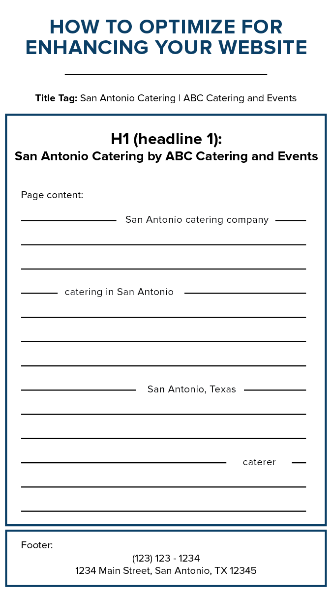
1) Put your address in the footer of every page. In fact, you should mention your location in these three key spots:
a. Title tag
b. H1
c. Page content

2) Also, create (or claim), verify, and maintain your Google Places and Business page. Get great reviews—they help your presence on Google, not to mention potential clients are more likely to take a deeper look at you because of them.
Optimize your site for both potential clients and you.
Your site should also be easy to use on your end—and we’re not just talking about the user-friendly WordPress, which we fully stand behind.
Get inbound leads through your contact form. It is one of the biggest ways your website will bring in new business. Create a contact form for conversion that’s optimized for both you and your potential client.
Get inbound leads with great content:
Create useful content that keeps people on the site and also encourages social sharing in these three steps:
1) Create a strategic content plan; then execute it so that people get onto your site through related searches.
For example, a content plan might include eight to 10 blog posts, varying in length, based on your key search terms for a select period of the year. The goal would be to increase website users interested in that specific key term(s), i.e., wedding caterers in New York City.
2) Promote your partners, as in venues and vendors. This will strengthen relationships and increase sharing opportunities.
3) Offer potential employee applications on your site along with career opportunities, as necessary.
Of course, a website should truly and honestly be a representation of your company, no matter what. These are some really important tools and tips to help you take that online representation of your company and really sell.
Molly Meyer is with www.nuphoriq.com, helping caterers grow their businesses, with an emphasis on website leads and growth.


