With each season comes new trends. But, while most caterers tend to focus on creating complex flavor profiles, featuring farm-fresh ingredients or harvesting the next best trendy cocktails, if those aren’t presented in a wow-worthy way, they’ll wilt away and lose their intended flair.
The caterers who win bids in today’s competitive landscape are the ones who not only cultivate delicious cuisine, but those who go further with impressive display and presentation; and the inspiration we’re sharing from CATIE awards finalists showcases just that.
These Best Action Station finalists truly went above and beyond traditional food presentation to grow their businesses, their authority, and their creativity! Today, we’re sharing tips so you can re-create or use this as inspiration to grow.
“Grow” by Catering by Design | Winner
The concept for this station was to create a greenhouse-inspired area that offered more of a “dinner and a show” type of experience rather than just a traditional station.

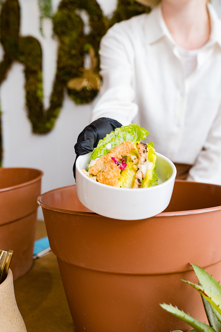
The concept for this station was to create a greenhouseinspired area that offered more of a “dinner and a show” type of experience. The team created playful seed packets that were labeled to correspond with one of the three small plate options being offered at the station. After selecting which “seed packet” they wanted to taste, guests then handed it off to the “gardener,” aka the station attendant. The gardener would then “plant and water” the seeds to sprout up a savory dish.Photo courtesy Frances Photography/International Caterers Association/Catering by Design
How it worked
The team created playful seed packets that were labeled to correspond with one of the three small plate options being offered at the station. Guests would choose the packet they wanted to taste and hand it off to the “gardener,” aka the station attendant. The gardener would then “plant and water” the seeds to sprout up a savory dish. How it sprouted up was perhaps the most surprising bit of all of this: a hand from a server seated below the table would pop up with the dish ready to serve. Talk about wow factor!
Design considerations
The most difficult part of the illusion was setting up a space that was comfortable and kept the mystery alive. They did this by creating a station that was tall enough to fit two servers underneath, seated on a cushioned bench. In front of the bench were the pots with edible dirt and tasty toppings that would sprout out of pots atop the table.
Then, the wall behind the station allowed for the passing of trays underneath, directly to the servers seated below, to keep alive the illusion of the pots sprouting the dishes!
Tips for Implementation
While it may seem daunting to create interactive displays like this, make it easier on yourself by reusing materials! Catering by Design used a brick wall they had fabricated for a former event to make execution simpler.
Ask yourself what you have in-house that you can pair together creatively for a fun, interactive design!
“Interactive Salad Wall” by Contemporary Catering | Finalist
Contemporary Catering wanted to ditch the boring plated salads for an event. After some brainstorming, they took the traditional “champagne wall” concept and applied it to tasty, fresh salads!

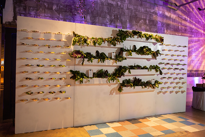
Interactive Salad Wall: Contemporary Catering wanted to ditch the boring plated salads for an event. So, after some brainstorming, they took the traditional “champagne wall” concept and applied it to tasty, fresh salads! Photo courtesy International Caterers Association/ Contemporary Catering
How it worked
The team offered three displayed salads, each of which had its own mini-shelf on the display wall. There were 100 mini shelves on two panels. So, for larger events, they would have their team on guard to replace each salad as it’s taken away. This also helps so salads don’t sit and wilt.
Design considerations
While building the wall, the team considered a few key factors:
- Durability and function
- Meeting the design vision
- Ease of construction
- Ease of transportation
So, they tested. The design team gave their sketches to the warehouse team, who went to work to build a 16ʹ x 8ʹ structure with three sections: two for displaying food and one for décor to spice up the visual.
The warehouse team experimented a bit and finally developed a design that would be durable and functional, aesthetically pleasing, and easy to transport to various events in the future.
Tips for implementation
As we mentioned, reusing previously fabricated displays is the way to go. When designing this wall, the Contemporary Catering team also created a user manual of sorts that could be referenced for future events. This way, no matter who was on the setup team or event team, they could easily set up and tear down, even if they’d never seen the wall before.
As you cultivate your display ideas, make sure you’re thinking of creating manuals, guides, and standard operating procedures for how to use, set up, and tear down for future events!
“Post-Apocalyptic Ration Wall” by Footers Catering
If we live through an apocalypse, we hope there are ration walls like the one Footers Catering created for this epic futuristic event.

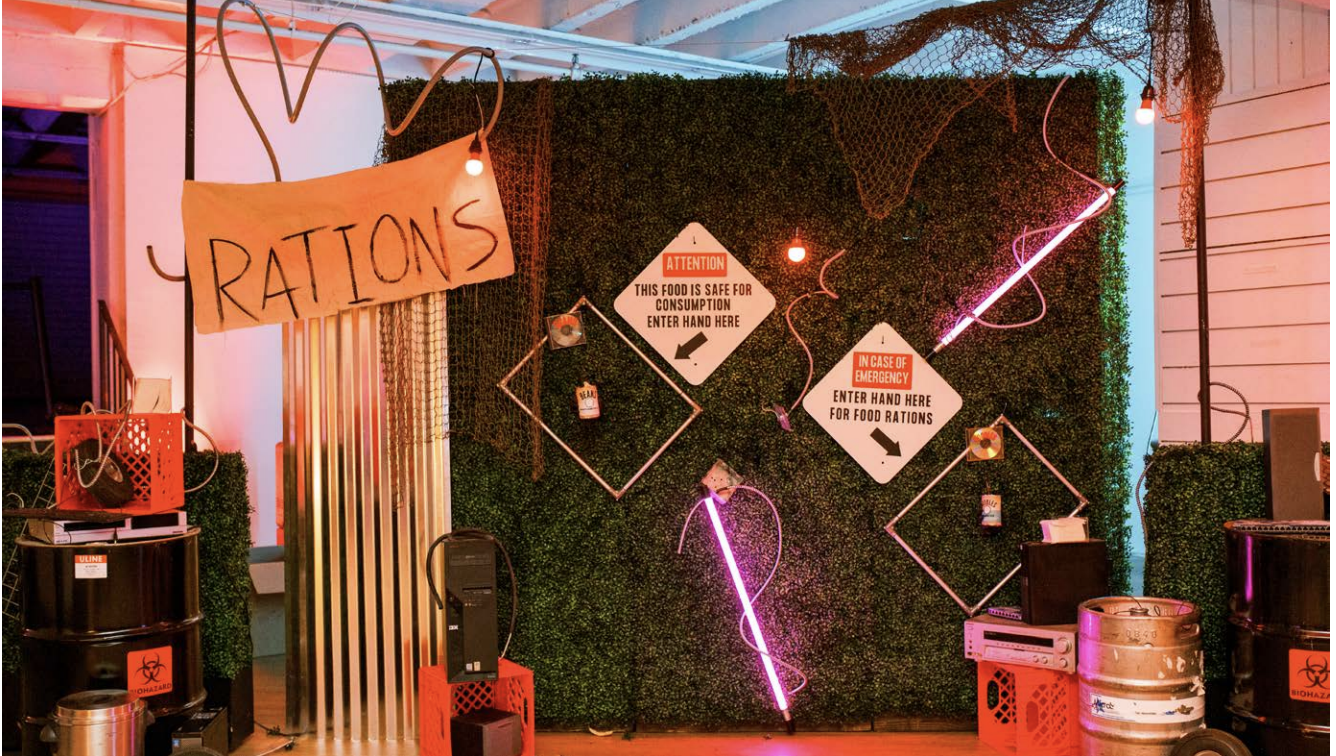
The year is 2142. The world is in shambles. Inside an abandoned warehouse, a community of 250 survivors ration what they can to live another day. Volunteer chefs scavenge anything they can find. To ensure riot doesn’t break out, inhabitants must reach their hand through the hedge wall to receive their ration. Photo courtesy International Caterers Association/Footers Catering
How it worked
With the year 2142 as inspiration, the team truly got into character— food rations, post-apocalyptic scenes, flickering lights, and fog décor, the whole nine yards. They used a cocktail wall they had in inventory and reimagined it for guests to put their hands behind the wall to snag their rations.
Design considerations
They didn’t want to go out and buy a ton of supplies for this, so the designers literally scavenged the warehouse to see what they could use to build the display. See a theme here? The team gathered empty kegs, old phones, VCRs, empty crates, and more to add to the display wall. Then, they created street signage and neon light bars to direct guests on how to stick their hands into the display to get their gourmet ramen or gigante bean salad!
Tips for implementation
The team did a better job than they thought, which was great for the theme, but not so great for guests in the beginning. Guests were a little afraid to reach their hands through to get their eats!
So, lesson learned—position a staff member at this style of display to help guests understand how to interact and get their delicious food. The simpler you make it for attendees, the more fun they’ll have!


